Many worldviews
There are many ways to represent the world on maps. Here are several examples of projections that have made or will make reference to.
Google Maps
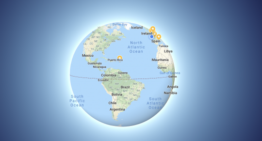
To replace the Mercator projection, new worldviews have recently emerged. Starting with the giant Google, which to represent the earth has definitely abandoned the planisphere in favor of a globe for its Google Maps application.
Equal Earth
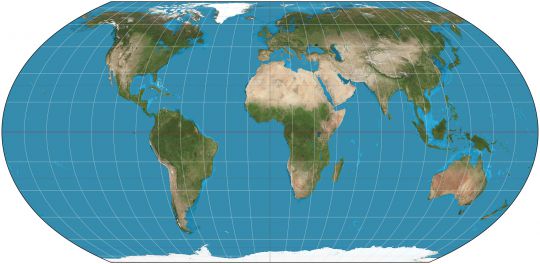
In August 2018, cartographers also proposed a new planisphere called Equal Earth, which was immediately adopted by NASA climatologists. It respects surfaces while minimizing deformation of continents. However, for us sailors, it is not at a constant angle.
Gall-Peters
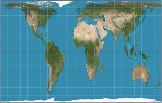
A month later, American students saw their usual Rombinson projection (quite similar to the Equal Earth projection) disappear in favour of the Gall-Peters projection. This mapping, which dates back to 1973, respects the relative surfaces of the continents, even if it stretches them towards the Equator and widens them to the poles.
Goode
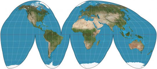
Other representations include that of Goode in the shape of an "orange peel" that respects angles and minimizes geometric distortions. But in this projection, the representation of the oceans makes no sense.
Postel
There are also projections that offer a totally different view of the world, such as Postel's polar azimuthal projection (1581), useful for Arctic navigation. It places the North Pole in the centre of the map. While it respects distances and directions from its centre, it distorts continents a lot by moving away from the centre. For the anecdote, this card appears in the UN logo.
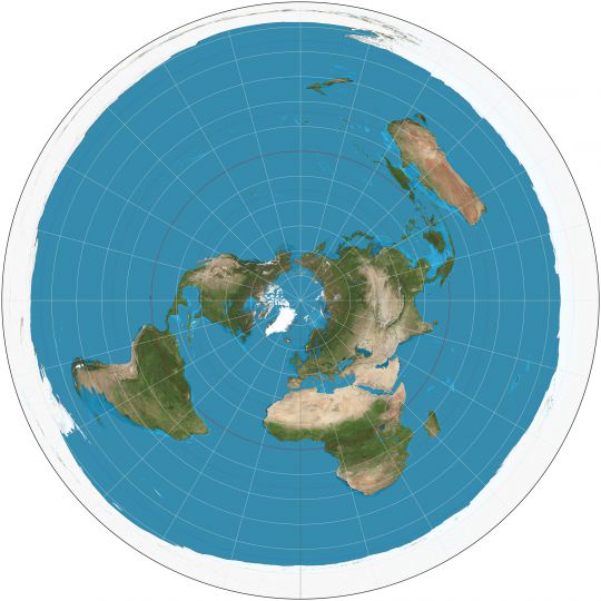
Choose how to represent your card
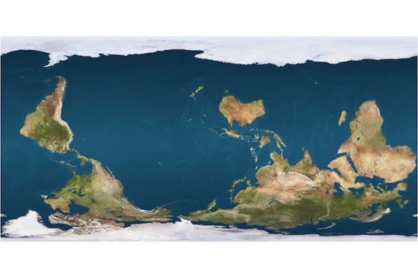
Each map author has chosen his or her representation. A map does not necessarily have the north facing upwards, because in space there is neither up nor down. There are many examples
- In the Middle Ages, the maps were centred towards the east,
- In 1979, the Australian Mc Arthur represented a map with the south at the top, to distinguish himself from a too European-centred vision.
- In 2002, Chinese social scientist Hao Xiaoguang unveiled a projection focused on the southern hemisphere. It became the official map of the People's Republic of China.
Similarly, if the planispheres are all centred on the Greenwich meridian for practical reasons (Pacific Ocean on the edges of the planisphere), the orientation differs from one country to another.
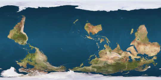
So, which one choisir??
Can we think that Mercator's representation is living its last hours after 450 years of good and loyal services?? Globalisation and our representation of the world are changing and we need new maps to understand it. But for us sailors, who entrust our course to a nautical chart, the Mercator projection will remain the most relevant - as long as we don't get too close to the poles
